Some branding projects
Milestone Rathfriland, Newry
Abacus Studio, a design firm renowned for their innovative approach, recently completed a comprehensive branding project for a multi-award-winning supermarket. Tasked with revitalizing the store's image, Abacus Studio designed a fresh, modern logo that reflected the supermarket's commitment to quality and customer experience. This new brand identity was seamlessly integrated into the store's interior design, creating a cohesive and inviting atmosphere. From the subtle color palettes and strategic lighting to the intuitive layout and bespoke signage, every element was carefully considered to enhance the shopping experience. The comprehensive package delivered by Abacus Studio has not only elevated the supermarket's aesthetic appeal but also reinforced its position as a leader in the industry through their instore made products to their excellence of service and comment to their customers.
The Creamery, Belfast
At Abacus Studio, we crafted a complete brand identity for The Creamery Belfast, encompassing logo design, interior decor, and eye-catching signage. Our playful logo features a charming cow-shaped cup with tea spoon for ears, tongue as the cup handle and a swirl of whipped cream as its "hair," perfectly capturing the whimsical spirit of The Creamery and their delicious homemade ice cream. This visual identity extends throughout the space, creating a cohesive and inviting environment for customers to enjoy not only the unique ice cream flavors but also the freshly brewed coffee on offer. We believe the branding we developed for The Creamery successfully communicates their commitment to quality and fun, establishing them as a must-visit destination in Belfast.
Uluru Bar & Grill, Armagh
Abacus Studio, a design firm known for its innovative approach, completed a comprehensive branding project encompassing interior / external signage and branding of point of sale. This visual identity was then seamlessly integrated into the interior design, creating a cohesive and engaging environment. From the selection of materials and color palettes to the strategic placement of furniture and lighting, every element was carefully considered to enhance the customer experience. The result is a unified and compelling brand experience that resonates with customers and sets the client apart from the competition.
Custom Coffee, Dundalk
Abacus Studio produced work for Custom Coffee, one of Ireland's most exciting new coffee shop franchises, as they opened their doors in Dundalk. Taking a holistic approach, Abacus Studio developed the complete brand identity, from the core logo and visual language to its application across all customer touchpoints. This included designing eye-catching signage for the Dundalk location, creating sleek and modern van graphics for their mobile presence, and developing a customer loyalty card program to foster repeat business. Even the design of the coffee cups themselves was carefully considered, ensuring a cohesive and appealing brand experience from the moment a customer receives their handcrafted beverage. Abacus Studio's work aimed to capture the unique energy of Custom Coffee and establish a strong brand presence as they expand throughout Ireland.
Loft56 Restaurant, Newry
Abacus Studio are proud to have worked in partnership with 3D2 of Belfast to create modern bistro interiors for Loft56 Rathfriland Newry, Co. Down, crafting both its brand identity and interior aesthetic. Abacus Studio developed a sleek and contemporary logo, incorporating clean lines and a sophisticated colour palette to reflect the bistro's fashionable atmosphere. This design language was then carried through into the interior, where they curated a space that balances comfort and style. Think natural materials juxtaposed with plush velvet seating, warm lighting highlighting natural wood finishes, and carefully selected artwork adding a touch of local character. The overall effect is a welcoming yet chic environment, perfect for enjoying a meal or drinks in a relaxed, modern setting.
Click3Sixty
Abacus Studio recently completed a branding project for a company specializing in 360 tours and integrative training, crafting a modern and forward-thinking identity. The studio developed a sleek and dynamic logo that visually represented the immersive and interconnected nature of the company's services. This modern aesthetic was then carried through into all aspects of the brand, including website design, marketing materials, and even the interface of their 360 tour platform. Abacus Studio focused on creating a brand that not only conveyed professionalism and expertise but also highlighted the innovative and cutting-edge approach to training and virtual experiences offered by the company. The result is a cohesive and compelling brand presence that positions the company as a progressive thinking company
Realice (Recovery Baths)
Abacus Studio designed the branding for Realice, a company specializing in handcrafted ice baths for recovery and wellness, to develop a compelling brand identity. The studio crafted a clean and minimalist logo that subtly hints at both the invigorating chill of the ice and the transformative benefits of cold therapy. This refined aesthetic was then applied across all brand touchpoints, from product packaging and website design to social media content and marketing materials. Abacus Studio focused on conveying a sense of premium quality, artisanal craftsmanship, and a contemporary approach to holistic wellness, resonating with a discerning clientele seeking a high-end recovery experience. The resulting brand for Realice is both visually striking and effectively communicates the rejuvenating power of their handcrafted ice baths.
Eacon Construction, Hilltown
Abacus Studio recreated a branding project for a construction company, imbuing their image with a sleek and contemporary aesthetic. The studio developed a modern logo that conveyed both strength and innovation, utilizing clean lines and a bold yet sophisticated color palette. This design language was then applied across all of the company's marketing materials. Abacus Studio focused on creating a visual identity that not only reflected the company's expertise and professionalism but also appealed to a modern clientele. The result is a cohesive and impactful brand presence that positions the construction company as a forward-thinking leader in their industry.
Coast Chemists
Abacus Studio recently worked with Coast, a new pharmacy franchise launching along the scenic north coast of Ireland, to develop their complete brand identity. The studio designed a logo that evokes health and well-being focus of the pharmacy. This visual language was then extended to all aspects of the brand, from the shop's exterior signage and interior design to packaging for over-the-counter products and marketing materials. Abacus Studio focused on creating a brand that not only resonated with the local community but also conveyed a sense of trust, professionalism, and a modern approach to healthcare. The resulting brand for Coast is both visually appealing and effectively communicates the pharmacy's commitment to serving the health needs of the coastal communities.
Companions of the Gospel
Abacus Studio recently partnered with a local Catholic religious group dedicated to serving their community, crafting a brand identity that reflects their mission and values. The studio designed a logo featuring a stylized peace dove taking flight from Noah's Ark, symbolizing hope, renewal, and the enduring connection to faith. Subtly incorporated within the design is the ichthys, the ancient symbol of the fish used by early Christians, representing the group's connection to Jesus and his teachings. This carefully considered imagery is intended to resonate with the community, conveying a message of peace, compassion, and spiritual guidance. The overall brand, encompassing the logo and supporting materials, aims to project a welcoming and supportive image, reflecting the group's commitment to serving the local community.
Nettlehill Supermarket, Lisburn
Abacus Studio in the passed have produced with Nettlehill, a multifaceted business encompassing a filling station, supermarket, and in-house deli, to develop a comprehensive brand identity. The studio designed a logo that reflects the diverse offerings of Nettlehill, perhaps incorporating elements suggestive of convenience, fresh food, and local sourcing. This visual language was then applied across all aspects of the brand, from signage for the filling station and supermarket to packaging for the deli's homemade products and marketing materials. Abacus Studio focused on creating a cohesive brand experience that highlights the convenience of the filling station, the quality and variety of the supermarket, and the artisanal nature of the deli's in-store creations. The resulting brand for Nettlehill aims to project a friendly and reliable image, establishing them as a one-stop shop for the local community.
Barbican Supermarket, Down
Branding worked completed for the Barbican, a multifaceted food emporium nestled on the coast at the foot of the Mourne Mountains, to develop a comprehensive brand identity. Encompassing a supermarket, deli, butchers, and fresh produce section, Barbican required a brand that reflected its diverse offerings and prime location. Abacus Studio designed a logo that incorporates elements of the coastal landscape and the Mourne Mountains, alongside imagery suggestive of fresh, local produce and quality meats. This visual language was then applied across all aspects of the business, from exterior signage and in-store displays to packaging for the butcher's counter and deli items, as well as marketing materials. Abacus Studio focused on creating a cohesive brand experience that highlights the quality and variety of Barbican's products, its connection to the local area, and its commitment to serving the community. The resulting brand for Barbican aims to project a welcoming and trustworthy image, establishing them as a premier destination for food shopping in the region.
Constant Grind Coffee Dock
Abacus Studio embarked on a fun and energetic branding project for Constant Grind, a coffee dock located within a bustling filling station supermarket. The studio designed a logo that captures the quick-paced, on-the-go nature of the coffee dock, using bold typography and a vibrant color palette to stand out amidst the supermarket environment. This visual identity was then extended to all aspects of the brand, from disposable coffee cups and signage to menu boards and promotional materials. Abacus Studio aimed to create a brand that not only attracts customers seeking a caffeine fix but also reflects the friendly and efficient service offered at Constant Grind. The resulting brand is eye-catching and memorable, helping Constant Grind establish itself as the go-to spot for a quick and delicious pick-me-up within the busy supermarket setting.
Custom Car Wash, Dundalk
Abacus Studio recently undertook a comprehensive design project for one of the largest automated car wash businesses in Ireland Custom Car Wash Centre, Dundalk. This ambitious undertaking saw Abacus Studio develop a complete brand identity, encompassing everything from the overarching brand strategy and logo design to the physical manifestation of the brand across multiple touchpoints. Their work included designing eye-catching signage for the car wash locations, creating impactful van graphics to extend the brand's reach on the road, developing modern and functional uniforms for staff, and designing effective point-of-sale materials to streamline the customer experience and promote special offers. Abacus Studio's holistic approach aimed to create a consistent and recognizable brand presence that reinforces the car wash's reputation for quality and efficiency, ultimately enhancing customer loyalty and driving business growth.
Mourneview, Dromore
Abacus Studio recently partnered with Mourneview, Dromore's exciting new multi-service supermarket, to craft a comprehensive brand identity and visual experience. Tasked with reflecting Mourneview's diverse offerings and community focus and unique landscape, Abacus Studio developed a striking logo and visual language that was then applied across a range of materials. From eye-catching wall graphics that guide shoppers and highlight key products to clear and informative signage both inside and outside the store, every element was carefully considered. Abacus Studio's work aimed to create a welcoming and modern shopping environment that reinforces Mourneview's position as a central hub for the Dromore community..
The Gourmet Grocer
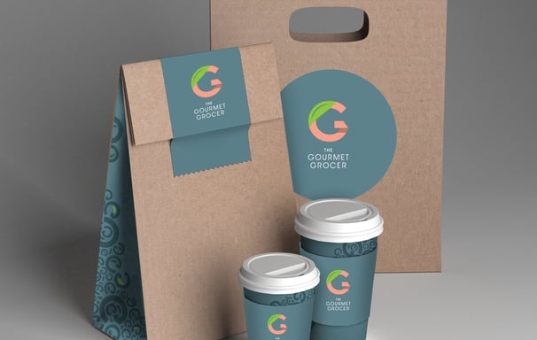
Abacus Studio recently developed a comprehensive brand proposal for The Gourmet Grocer, envisioning a high-end supermarket experience with a strong emphasis on sustainability. Their design concept focused on creating a sophisticated and inviting atmosphere, reflecting the premium quality of the products offered. Beyond the aesthetics, Abacus Studio prioritized eco-conscious practices, incorporating renewable and recyclable materials in packaging for prepared foods. The proposed packaging solutions emphasized minimal waste and utilized biodegradable or compostable materials wherever possible, aligning with The Gourmet Grocer's commitment to environmental responsibility. The overall design aimed to create a luxurious shopping experience that is both visually appealing and environmentally conscious, appealing to a discerning clientele that values quality and sustainability.
Hacketts Pharmacy
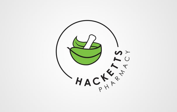
Abacus Studio completed work for Hackett's Pharmacy to develop a refreshed brand identity, centred around a unique and symbolic logo. The design features the classic mortar and pestle, instantly recognizable as a symbol of pharmacy, but with a clever twist: the pestle itself is shaped like a leaf. This subtle yet meaningful addition represents the natural healing power of plants and underscores Hackett's commitment to well-being.
James & Sons
Abacus Studio designed a project for James & Sons Off Sales to develop a brand identity that exudes tradition and quality. Inspired by the classic aesthetic of old whiskey labels found on barrels, the studio crafted a logo that evokes a sense of heritage and craftsmanship. The design incorporates vintage typography, and a color palette that reflects the rich hues of aged spirits. This classic branding was then applied across all aspects of James & Sons' visual presence, from signage and packaging to marketing materials, creating a cohesive and memorable identity that resonates with their target audience and reinforces their commitment to providing a premium selection of beverages..
Joe McGee Butchers
Abacus Studio recently completed work for Joe McGee Butchers to craft a brand identity that honors the company's rich history and family values while projecting a clean, modern image. The studio designed a logo that incorporates classic serif typefaces, evoking a sense of tradition and established quality. This traditional foundation is then balanced with a clean and contemporary design aesthetic, through the use of minimalist graphic elements or a restrained color palette. The overall effect is a brand that feels both timeless and current, reflecting Joe McGee Butchers' commitment to time-honored practices and their ability to meet the needs of today's consumers. This branding extends to all aspects of their two business locations, from signage and packaging to marketing materials, creating a cohesive and compelling presence that resonates with their customers.
Bella Coffee
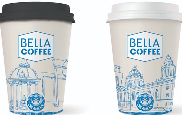
Abacus Studio recently developed a brand proposal for Bella Coffee, focusing on a unique and visually engaging coffee cup design. Their proposal showcased a series of coffee cup concepts that illustrated iconic Belfast monuments with a clean, modern aesthetic. These designs aimed to capture the city's rich history and architectural beauty, subtly weaving local pride into the everyday coffee-drinking experience. The minimalist approach ensured the monument illustrations remained the focal point, creating a sophisticated and memorable connection between Bella Coffee and the city of Belfast. This thoughtful design proposal sought to elevate Bella Coffee's brand identity, positioning them as a purveyor of not just excellent coffee, but also a celebration of local heritage..
Marshall Howe
Abacus Studio developed a comprehensive brand proposal for Marshall Howe, encompassing their diverse offerings as a florist, fruit and vegetable supplier, and producer of fresh, prepared meals. The proposal explored a visual identity that reflects the freshness and quality of their products, perhaps incorporating natural imagery, vibrant colours, and a clean, modern aesthetic. Consideration would have been given to how this branding would translate across different platforms, from in-store displays and packaging for their prepared meals to delivery vehicles and online presence. Abacus Studio's aim would be to create a cohesive and compelling brand that positions Marshall Howe as a trusted source for both beautiful blooms and delicious, convenient meals, appealing to a wide range of customers. The icon represents 'mh' in the shape of an apple, illustrating face.
